A home of your own on the web
Thoughts, work, and links to people worth knowing. This entry is a design example only.
Subscribe via RSSFamiliar links, glossy buttons, and a little corner of your own. Carrying forward the warmth of Web 2.0, with content people and agents can understand.
Put content first and build relationships through links. Blue marks links and actions, light backgrounds make room for reading, and raised highlights draw attention to elements worth clicking and remembering.
The rounded wordmark and Next badge form one unit. Keep them together and preserve their proportions.
Peer to peer, specific, and open. Preserve each person’s voice and name actions with clear verbs.
Paper white provides a background for content; blue marks links and actions. Light blue groups content, green highlights connections between people and agents, and orange is reserved for RSS.
--paper#fafcff--blue#214fe8--ink#182745--sky#eaf2ff--green#d9f58b--muted#52627a--line#d7e1f0--white#ffffff--rss#c34b08Body copy prioritizes system fonts with Chinese support; the brand uses rounded sans-serif lettering. Longer passages have more line spacing, while headings stay compact. Chinese and English share the same hierarchy.
"PingFang SC", "Microsoft YaHei", sans-serif"Arial Rounded MT Bold", "Trebuchet MS", sans-serifExpress yourself. Connect with others.
Express yourself. Connect with others.
Express yourself. Connect with others.
Express yourself. Connect with others.
Express yourself. Connect with others.
Express yourself. Connect with others.
Common spacing follows a 4px base. Keep related things close and give sections room. Wide layouts sit side by side; narrow layouts follow the reading order.
--space-14px--space-28px--space-312px--space-416px--space-624px--space-832px--space-1248px--space-1664pxMain content becomes a single column below 900px. Navigation wraps below 600px. Pages remain readable at 320px wide.
Corner radii vary by component. Inputs have light borders, primary buttons have glossy highlights and a raised edge, and share posters have soft shadows.
--radius-small4px--radius-input8px--radius-button10px--radius-panel14px--radius-pill30px--gradient-button--shadow-posterExpress yourself. Connect with others.
Use a primary button for the main action and text links for reading and navigation. Keep keyboard focus visible and unavailable actions distinct.
Click a button or use Tab and Enter to see its feedback.
An interactive example. Nothing you enter is submitted or saved.
Choose a language
Content components use consistent link styles, spacing, and reading hierarchy. These examples show tags, badges, RSS, directory entries, and the empty state.
Component example
Thoughts, work, and links to people worth knowing. This entry is a design example only.
Subscribe via RSSShare your blog, portfolio, or small experiments. Follow links to discover what others make.
The footer pairs the brand with GitHub and RSS links and the blue “I ♥ personal websites” badge. Navigation has three sections at the same level: “Explore the open web”, “For agents”, and “Project”. They sit below the brand on smaller screens. The llms.txt introduction appears under “For agents”.
View this page’s footerImages use the same colors, fonts, and badges. Portrait cards are for saving and sharing; landscape cards are for website link previews.
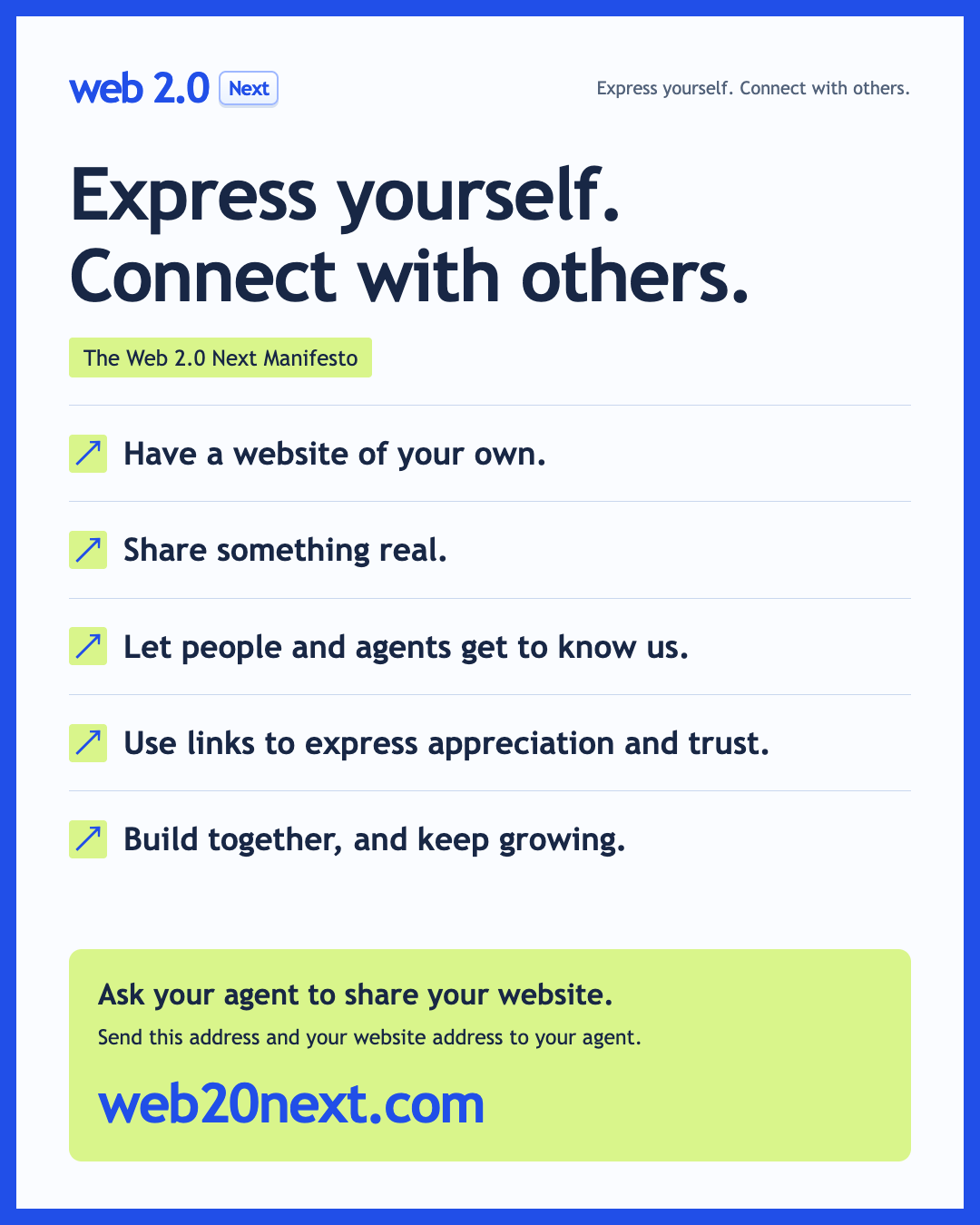


Links are recognizable and feedback uses text. Keyboard focus has a blue outline, images include alternative text, and reduced-motion preferences turn off smooth scrolling.
Use Tab to move focus and Enter to activate links and buttons. Select some text to see the green selection color.
Identity and principles